Showing posts with label posters. Show all posts

Monday, June 1, 2009

Dial 3 for...

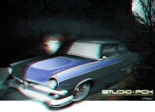
...3D, I guess.anaglyph print

Having always been a fan of classic movies, and even more, an Alfred Hitchcock fanatic, I took a rare couple of hours last week to sit and watch a film. The day’s selection? “Dial M For Murder”, Frederick Knott’s great play-turned film. If you’ve never seen the movie, do yourself a favor, and scare up a copy. It’s typical Hitchcock visionary cinema, and is so far ahead of its time, presentation-wise, that it boggles the mind. What’s really slick about the film (beyond the incredibly intimate camera angles) is the use of very limited sets. The majority of the film takes place in an apartment, by the the story makes you forget that.

Anyway, why bring up this film? The movie was filmed and subsequently released in 3D back in 1954, coincidentally, the year that the fictional scene depicted in the image with this post takes place (...it always ties together, doesn’t it?). What’s great about this film in particular is that it wasn’t the typically hokey 3D spectacle… It used the effect brilliantly and subtly. Granted, in ‘54, there were a ton of 3D movies, and most of them bad, thus, “Dial M for Murder”, shown in 3D, didn’t fare so well, which is a shame, because, as we’ve touched on before, it was done superbly and subtly.

If you’ve got a pair of the old red and blue 3D glasses laying around, dig on the pictures that accompany this post…


moonshine runner 3d
I’m a fan of subtlety, always opting to take the “less is more” route, and playing with a design to harness some serious visual impact from a well-placed modification. Perhaps that’s why Hitchcock’s films appeal to me: they are well-crafted, and sort of sneak up on you, making you re-examine a scene, study the details a bit more carefully, and pay closer attention. In the last issue of Rod and Custom, I was fortunate to have had another piece featured as their “Dream Car of the Month”, that being the ‘53 Ford moonshine runner, which illustrates this subtle approach perfectly. There’s a lot going on with this car, but it’s presented in a very subtle way (on the car itself, anyway… Racing through the woods in a custom car isn’t precisely “subtle” by any means…). It’s got many layers to dig through, and the narrative behind the image is pure fun… But it’s what was on my mind when creating it that makes this so damn cool.

When I began drawing the car, the scene was already set in my mind: there would be a dark, moonlit night in 1954 (ahhh…. it’s all tying together!), a bed of red clay, a police car in pursuit, and some moody lighting. But what made this piece unique in my portfolio was that I kept seeing this thing in 3D… stereoscopically. I set out to create multiple versions of the piece, and there had to be one that used 3D glasses. No two ways about it, that’s what my mind kept going back to, and I was determined to reach into my bag of tricks, pull out a clever technique, and apply it to this piece.

It was fun to make the trees “pop” out and recede, to make the lights gain some depth and “flicker”, and to work to make the features of the car visually sit in their rightful places in space. It’s a lot of work to get things “right” (working a drawing into 3D isn’t as easy as working from a couple of photographs, and requires a TON of planning and work… but the results are just damn cool), and when they fall into place, the results are stunning. I’ve been experimenting with a number of my older pieces using this technique, and I even have prints available (with killer plastic-rimmed anaglyph glasses-- comfy and stylish!) on my site at www.problemchildkustoms.com

In any event, what this all boils down to is that I’m happy to be having fun with it all again, and after applying some inspiration from a great cinematic experience, I’ve embarked on a new path with my work… It’s getting to the point where I can invite you to reach into my work, and see it in a whole new way… and how cool is THAT?!

hot rod artLook for more soon…

Thursday, April 30, 2009

Going to the movies...

…as a kid was a big deal. We didn’t do it often… it just wasn’t in the cards. But when we did go, man… it was a total experience. I enjoyed any film we’d see, but I always held a special fascination with the theater lobby, namely the movie posters. Looking back on it, aside from cars, a few notable children’s books and assorted product packaging, movie posters were my first real exposure to design. (as a side note, after seeing Jason and the Argonauts as a kid, my obsession with stop-motion animation and film was ignited… Ray Harryhousen permanently warped my fragile young mind!) To say that there was an impact in that would be an understatement… I was floored by the graphics, the layout… the ability of an artist to convey the general scope of the story, to excite moviegoers into plopping down their cash for a ticket (in many cases, anyway— some just stunk up the joint) was, consciously, anyway, my first real understanding of print design as an emotional trigger.


I grew up on kung fu/horror/fantasy movies...and you wonder why I mash different topics together like I do...

Fast-forward a few years, and my interest in movie posters and film itself was still growing. I loved movies almost as much as I did cars, and my friend Joe was a total movie nut, namely horror films. The guy knew literally every horror film, director, production house… he was a walking encyclopedia of the genre (as well as sci-fi films… not so odd that he’s gone on to write some great books!). This was in the heyday of VCR’s and video rental houses, and what made it great was that we had access to so many movies, as the classics (meaning both “great” as well as just “old”) were being released by the dozens. Companies like Vestron (they essentially revolutionized video distribution, and pumped out roughly 3,000 movies on videotape between ’83 and ’95… there’s some more useless trivia that clouds my brain daily), MGM/UA, Embassy, AIP and more were releasing tons of independent, low-budget, B-grade and major releases… From The Stuff andBlade Runner to Revenge of the Living Zombies, Basket Case to Xtro, man, we watched a TON of VHS-format celluloid. We’d try to seek out some great films, and it was in doing this that I was introduced to the work of Hammer Films, a stand-out among the many great (and not so great) productions we’d watch.

What made the Hammer films so great was the way they told the stories, and the era they came from! Their horror and sci-fi boom was ’55-’59… Coincidentally, the golden age of custom cars… hmmm… Anyway, Hammer’s horror films were more “gothic” in nature (monsters, based more in terror, with a back-story that makes you feel a bit for the players), and they often re-told classics like Dracula, The Mummy and Frankenstein (sixFrankenstein films from’59-’74, no less). Great actors like Peter Cushing and Christopher Lee were regulars, and man… they were just tremendous entertainment, even for two kids discovering them almost 30 years after their release. The films had a great look, but, again, what infatuated me was the cover/poster art! Tom Chantrell was the wrist behind many of the great designs, and just had a knack with not only killer art, but amazing layout and design. I think that a lot of my color work is influenced, be it unconsciously or otherwise by the man’s work. Keeping a loose yet detailed feel in my work is directly attributed to Mr. Chantrell’s influence, as well as that of Saul Bass (whose mantra was “Symbolize and Summarize”—how insightful is that? Spare yourself four years of design school, and just repeat that… then send me the money you saved. OK, half. More on Mr. Bass later… and I mean Saul, not Lance. Although, I may have a great way to compare him with cars. I’ll think of it.). Bold, direct, powerful. You’d know Bass’ work anywhere:


My infatuation with movie posters continues to this day (although with three young kids, my serious collecting days are some time off, yet). As a kid, the work of Drew Struzan was everywhere… remember the posters for Indiana Jones? The Goonies? Technical brilliance! My tastes fall somewhere between the amazing portraiture of Struzan, the expressionistic and detailed style of Chantrell, and the bold graphic statement of Bass… All have been a profound inspiration in my design and illustration work. It’s still a point of fascination for me when we go to see a movie… I wander around, and check out the new posters. However, it seems as though the true art of the movie poster is falling to the side of the road, as far as mainstream movies go, anyway. Independent films have always had kind of cool (and occasionally bizarre) poster art, but lately, it’s as though the fine art has gone away. The new Indiana Jones film brought back a spark of life, though… Struzan nailed it again! …and the new Batman flick?! Man…. Great stuff, and the two versions, each with the burning bat symbol (one of Batman, one of the Joker) are great, and really play up the menacing undertones (and overtones, let’s be honest here) of the movie. Would a hand-painted or rendered piece have been better? I submit that in this particular example, it could not. There’s a time and place for almost every style and technique, it would seem.


Does it get any better than this?

In any event, I bring up the movie poster art topic for a few reasons… One, you may not have been aware of the things covered here (Hammer horror films, the posters, the designers), and I enjoy opening up a new subject for you to head out and experience; Two, I had wanted to answer a few questions that I’m often asked (“where do you get inspiration from?”, “how did your style develop?” and “what the hell are you talking about?”); and three, hopefully, to inspire new designers who are trapped into relying on software and computers to draw for them to seek out what makes design and art so damn fun to begin with: creating it by hand! We’re already inundated by computer-generated, “cold”-feeling works that lack that human personality that shines through in all artwork. Now get out there, watch an old b-movie, seek out some wild inspiration from beyond the automotive sphere, break out the pencils and raise the bar…