Thursday, April 30, 2009

Going to the movies...

…as a kid was a big deal. We didn’t do it often… it just wasn’t in the cards. But when we did go, man… it was a total experience. I enjoyed any film we’d see, but I always held a special fascination with the theater lobby, namely the movie posters. Looking back on it, aside from cars, a few notable children’s books and assorted product packaging, movie posters were my first real exposure to design. (as a side note, after seeing Jason and the Argonauts as a kid, my obsession with stop-motion animation and film was ignited… Ray Harryhousen permanently warped my fragile young mind!) To say that there was an impact in that would be an understatement… I was floored by the graphics, the layout… the ability of an artist to convey the general scope of the story, to excite moviegoers into plopping down their cash for a ticket (in many cases, anyway— some just stunk up the joint) was, consciously, anyway, my first real understanding of print design as an emotional trigger.


I grew up on kung fu/horror/fantasy movies...and you wonder why I mash different topics together like I do...

Fast-forward a few years, and my interest in movie posters and film itself was still growing. I loved movies almost as much as I did cars, and my friend Joe was a total movie nut, namely horror films. The guy knew literally every horror film, director, production house… he was a walking encyclopedia of the genre (as well as sci-fi films… not so odd that he’s gone on to write some great books!). This was in the heyday of VCR’s and video rental houses, and what made it great was that we had access to so many movies, as the classics (meaning both “great” as well as just “old”) were being released by the dozens. Companies like Vestron (they essentially revolutionized video distribution, and pumped out roughly 3,000 movies on videotape between ’83 and ’95… there’s some more useless trivia that clouds my brain daily), MGM/UA, Embassy, AIP and more were releasing tons of independent, low-budget, B-grade and major releases… From The Stuff andBlade Runner to Revenge of the Living Zombies, Basket Case to Xtro, man, we watched a TON of VHS-format celluloid. We’d try to seek out some great films, and it was in doing this that I was introduced to the work of Hammer Films, a stand-out among the many great (and not so great) productions we’d watch.

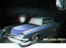
What made the Hammer films so great was the way they told the stories, and the era they came from! Their horror and sci-fi boom was ’55-’59… Coincidentally, the golden age of custom cars… hmmm… Anyway, Hammer’s horror films were more “gothic” in nature (monsters, based more in terror, with a back-story that makes you feel a bit for the players), and they often re-told classics like Dracula, The Mummy and Frankenstein (sixFrankenstein films from’59-’74, no less). Great actors like Peter Cushing and Christopher Lee were regulars, and man… they were just tremendous entertainment, even for two kids discovering them almost 30 years after their release. The films had a great look, but, again, what infatuated me was the cover/poster art! Tom Chantrell was the wrist behind many of the great designs, and just had a knack with not only killer art, but amazing layout and design. I think that a lot of my color work is influenced, be it unconsciously or otherwise by the man’s work. Keeping a loose yet detailed feel in my work is directly attributed to Mr. Chantrell’s influence, as well as that of Saul Bass (whose mantra was “Symbolize and Summarize”—how insightful is that? Spare yourself four years of design school, and just repeat that… then send me the money you saved. OK, half. More on Mr. Bass later… and I mean Saul, not Lance. Although, I may have a great way to compare him with cars. I’ll think of it.). Bold, direct, powerful. You’d know Bass’ work anywhere:


My infatuation with movie posters continues to this day (although with three young kids, my serious collecting days are some time off, yet). As a kid, the work of Drew Struzan was everywhere… remember the posters for Indiana Jones? The Goonies? Technical brilliance! My tastes fall somewhere between the amazing portraiture of Struzan, the expressionistic and detailed style of Chantrell, and the bold graphic statement of Bass… All have been a profound inspiration in my design and illustration work. It’s still a point of fascination for me when we go to see a movie… I wander around, and check out the new posters. However, it seems as though the true art of the movie poster is falling to the side of the road, as far as mainstream movies go, anyway. Independent films have always had kind of cool (and occasionally bizarre) poster art, but lately, it’s as though the fine art has gone away. The new Indiana Jones film brought back a spark of life, though… Struzan nailed it again! …and the new Batman flick?! Man…. Great stuff, and the two versions, each with the burning bat symbol (one of Batman, one of the Joker) are great, and really play up the menacing undertones (and overtones, let’s be honest here) of the movie. Would a hand-painted or rendered piece have been better? I submit that in this particular example, it could not. There’s a time and place for almost every style and technique, it would seem.


Does it get any better than this?

In any event, I bring up the movie poster art topic for a few reasons… One, you may not have been aware of the things covered here (Hammer horror films, the posters, the designers), and I enjoy opening up a new subject for you to head out and experience; Two, I had wanted to answer a few questions that I’m often asked (“where do you get inspiration from?”, “how did your style develop?” and “what the hell are you talking about?”); and three, hopefully, to inspire new designers who are trapped into relying on software and computers to draw for them to seek out what makes design and art so damn fun to begin with: creating it by hand! We’re already inundated by computer-generated, “cold”-feeling works that lack that human personality that shines through in all artwork. Now get out there, watch an old b-movie, seek out some wild inspiration from beyond the automotive sphere, break out the pencils and raise the bar…

Friday, April 24, 2009

"Lost between tomorrrow and yesterday..."

..."between now and then," sang Ray Davies...

And you know, that song has been stuck in my head for weeks. It's been years since I first heard the Kinks' song "Do It Again", and it kind of slid its way into the soundtrack of my life... What made me bring this up is the recent train of thought I've been on, with respect to my work, art and life in general. It seems that as things drift closer and closer to the absurd, I'm finding my inspiration in the very stuff that got me into this in the first place, which, as it turns out, is just absolutely beautiful.

Consider a few things, if you'll humor me (on what has become a long-ass post):

Like anything you find an interest in, eventually you move forward from that original starting point, and hopefully improve upon it, build your skills, and in some instances, find new inspiration someplace else. For me, my interest in art started with comic books, the MAD Magazine and CARtoons Magazine, finally leaping to fine art, namely surrealist paintings and Op-Art. While attending college, I majored in Fine Art, painting and drawing, and was thankfully exposed to a number of different styles, techniques, approaches... and I'd say that just about 90% of it was shit. Somewhere, it seems, craftsmanship was replaced by some rote technique, and "trendy" found a home in the one place it should have never been allowed.

My answer to that? I drew cars again. With the art world pandering to any two-bit hack with a brush, there was a certain peace in sketching hot rods and customs. I moved along with the times, bringing the digital tools into my work, and have continued to push the combinations of organic and electric. But every now and then, I slip into a comfortable routine, and just hit "auto pilot" for a bit... Yeah, I feel kind of guilty about that. I become the very thing that makes me rebel in the first place... And you know what? It's good. It brings about some good, I should say!

What's truly unique about this particular moment is that I have, for the first time, combined a lot of those early influences into my work at the same time. It's been amazing, and only getting better! The point here, though, isn't so much about what has BEEN inspired, but more WHAT has inspired.

I looked back at my more artsy roots, and recall the first time I saw Victor Vasarely's work "Vega-Nor", an Op-Art ("optical art") piece at the Albright-Knox.


This painting warped my young brain... not surprising, as that was its intent... After all, the point of Op-Art is to toy with one's perception, using color and line. I really learned more about using line quality from that piece than anywhere else! It was later in life, while working on a rendering that I stopped to consider just how much depth you could create on paper just with line pressure... up until then, I had a pretty good idea, but the process and idea just seemed, well, natural. Vasarely, mind you, was well ahead of his time. Granted, this whole Op-Art movement was set in motion by the German mathematician (and artist!) Josef Albers, who experimented in the '30's with color, working to create spatial effects, but Vasarely moved it forward, working to create work that all could enjoy and take part in... kind of an anti-agenda, if you will... and as for being ahead of his time? Consider that in 1953, the man stated that "In the future, we will attend projected exhibits by contemporary artists. Two days will suffice to send a large show by envelope to any point in the globe. And in the attached letter, as in some sort of partition, in cyphers and terminology, the artist will present the initial and true conditions of his creation."

Holy (expletive) premonition!!

Continuing this thought, he added that "from now on, the new technologies are here to diffuse art instantaneously to the masses." Ponder this.... the man essentially predicted email, and the use of a means to reach millions in moments, using art coupled with technology. Thinking about this over the past few weeks, it hit me that truly, I was, like the Kinks song mentioned earlier, getting back to where I started! (definitely "lost between tomorrow and yesterday, between now and then"!) Here I am, playing with technology, and bringing in the old techniques. How cool is THAT??! (of course, to keep my cred with the artsy camp, I could point out the irony of using a pop band to illustrate an awakening based in art itself... that should buy some time and sound deep, too)

Over on the opposite side of this note, we have the unseen forces that make it all happen... Beyond the lines and colors and techniques, we have the almost intangible combinations of things that inspire a work to begin with. It's that collection of inspirations that bring us to grab a pencil to begin with... all of those thoughts and items that begin to form a mental image. Each piece, no matter how insignificant on its own adds to the total. By concentrating on these smallest parts, a bigger picture forms... On that thought, I suppose that this is why I've always held a certain disdain for the Nihilistic approach, as it makes no sense at all. To simply start with nothing, and build upon nothing to acheive, well... nothing... is completely illogical. Every little spark springs forth something bigger than itself, and if you've been fortunate to surround yourself with positive, creative influences, then you're going to boldly go where no man has gone before, to to blatantly lift a phrase. Everything has some value, it has to by its very nature... Your job, then, is to not only recognize what is there, but determine its value, and find the right place for it in your work (or life!). Victor Hugo made the point that "There is no such thing as nothingness, and zero does not exist. Everything is something. Nothing is nothing."

So, I suppose, it's remotely odd that I'd look fondly upon Op-Art and Surrealism so fondly, when either could, at any moment fall over the edge into Nihilism, and eat itself. Perhaps that is what makes it so damn fascinating to me in the first place. Walking that very fine line, and doing its own thing for shits and giggles. It's the same reason that I enjoy the whole "Theater of the Absurd" movement (and its relevance to modern life)... it takes something so necessary for communication (language), and places complete distrust in it, opting for an alternative to illustrate a point... Combvine that with the paragraph above, and you'll gain insight to my values system, and just why I work as hard as I do: If you consistently think, walk and work outside of the box, you're going to find some truly unique ways to approach a creative project or problem, and the end result will be something loaded with fresh meaning.

It's no different than customizing a car, really. You simply have to look beyond what was placed in front of you (the stock car), and find a new way to express an alternate form from it. Consider that, in linguistic terms, having the same car as everyone else would be, by nature, a cliche'. While the Theater of the Absurd attempted to show an audience through an onslaught of cliche's, overly-technical jargon and essentially unconventional speech that they could elevate their communication by seeking more authentic means, and thus communication more clearly, customizing a car communicates non-verbally, and far more effectively that we are all individuals. It goes light years beyond the spoken or written word (which is why, most likely, that the photos in car magazines are so big compared to the text!) And perhaps that's a scientific explanation of why a mild custom works so well... there is beauty in simplicity, and by golly, when applied to a car, it transcends art.

What's also neat about this whole Theater of the Absurd/Op-Art/Brian's listening to the Kinks again deal is how there really is no conflict when done right... much like designing a kick-ass custom. Flow is everything! Consider this video (a visual version of "Bulbous Bouffant" by the Vestibules, a long-time favorite of mine)... Consider the communication... odd, not a lot of sense, but it entertains, and finds a rhythm:


Like any good design, it drags you along for the ride, enjoying the flow, and really not asking for a hell of a lot in return. And that, my friend, is a magical thing... When you can combine a couple of things, and just make it "happen", it's icing on the cake. Here's hoping you'll stay tuned and enjoy the ride! To say the least, I'm pretty stoked about where its all heading now, and the clients I've been fortunate enough to have are right along on this ride, making it even more fun. Like the song at the start of this entry says, "day after day I get up and I say I better do it again", and that takes us, literally, back to where we started...

Thursday, April 23, 2009

A (40-lb!) chip off the NEW block...

Like a Hollywood starlet, the mighty Camaro is mill dieting... think of it as a "crash diet", but on a CNC machine. The goal is 2700-lbs (about 70-lbs less than someone whose name rhymes with "Dozy O'Ronnell"), and by golly, we're not leaving anything to chance.


engine block
Project "Sick Seconds" is racing toward its debut at the SEMA Show (see it live in the Gear Vendors booth!), and a big part of the assembly process has been removing things... namely any pesky poundage. As a testimony to the serious approach being taken in this respect, imagine looking at the engine block and thinking "yeah, we can lose a few pounds there, too", and then milling 40 lbs. from the brand new piece? That's just what the gang at LSM Systems Engineering did, chiseling with fine precision at the outside of the block, working toward the valley tray:


hot rod project
As KMP Performance and Machine (the engine builder) said, "It's almost too nice to use!", and I think you'll agree with the photos here!

You can read more in the June 2009 Popular Hot Rodding Magazine, and be on the lookout for this monster on the show floor, the track... and even the street! The Camaro will be running 1,200 miles between tracks as part of Drag Week, so you'll have plenty of time to check it out in full race set-up, as well as street guise, wearing a set of absolutely killer Bilet Specialties wheels (16x16-inch beadlocks on the strip, and massive 20-inch rollers for street use) on Mickey Thompson rubber! More updates coming soon over on Studio PCK...

Monday, April 20, 2009

A pun-tastic romp through Trannyland...

I’m browsing a couple weeks ago, and came across this video:


A field FULL of transmissions. Man, it’s a veritable shitload of transmissions. Is this collection still growing? Is this a mounting problem? A planetary disaster waiting to happen?

Perhaps this guy’s just really in synch with his collection... He may have been in the sun too long, a bit unstable, or maybe he blew a gasket, but that’s just my input. Seems to be an almost sealed case after filtering the evidence. But, if his family banded together, mounted an effort, and pumped some energy behind it, perhaps their pressure would result in a clutch situation, and things would run smoothly, almost fluid, if you will. Hopefully they can get this moving before someone passes another regulation.

I mean, what his yard needs is something more than a quick pickup... any dipstick can see that. Unloading that collection would really get his financial wheels in motion, and convert his neighbors to happy campers, versus being so tourqued-off, and switching their pitch to a more pleasant output... before someone throttles him, or chokes him with a length of cable, and winds up in the joint. I know it has me geared up.

I was going to remain neutral about this guy’s crop of transmissions, and not get on his case, but after seeing the video again, and all of those cores parked there, I’m reversing my position. I can’t imagine his neighbors adapting to the situation... they’re probably thinking “Hey Jack, we’re not taking this anymore. We’ve put our cause into overdrive, and calling the housing committee, in the hopes that they'll provide leverage, so don’t get all shifty with us. Property values are slipping! We shudder to think of where they’ll be in a year!”

Foaming at the mouth, they’ll drive him out of the community before things get too low, I’d imagine…. just a matter of pushing his buttons, and getting the county to seal his fate. They’ll have to hire a toploader to get those things over to the rock crusher, and that’ll be a lot of manual labor.

Hey… this stuff won’t happen automatically, you know.

More enjoyable nonsense (and some sense, too!) over at Studio PCK Hot Rod Design.

An a-MAZE-ing follow-up!

…and how killer is this??! A while back, I had written a bit about one of the more influential custom cars in my past, Mr. Jerry DeVito’s ‘57 Ford, aptly named “The Maze”. I had reported what I found through research on the car, and was left with a few lingering questions about the car… so I did what was natural, and asked for help finding those answers.

I was fortunate to not only find those answers, but got them FROM THE MAN HIMSELF! Mr. DeVito took time from his day to chat for a while, and I walked away from that great conversation with not only some fantastic insight, but a great new friend. I’ll report more on this soon, but wanted to share my excitement over meeting the man who created a car that left an impression on me as a car-struck kid, and one that always creeps into my imagination as I draw and design.

Suffice to say, there are a few facts that need ironing out from the first posts on this car (as I said, the research materials were limited), and we’ll do just that in subsequent posts… But to answer that nagging question about the split bumper treatment, they were ‘57 Pontiac units, and the change was made in the first year (after the peaks and scoops). Jerry’s inspiration was to always keep the car fresh, making changes after each show, always remaining at the of of his game…

We’ll trace the car’s history in the near future, from delivery at San Jose Ford in ‘57, through to its sale, and subsequent loss. Thanks for the interest, and especially to Mr. DeVito… wow…

More Maze Madness!

When last we left off, we were discussing the ‘57 Ford aptly named “the Maze” (scroll down to read it, if you missed out on part one… we’ll wait up!). A little digging unearthed some cool stuff, and really fills in some of the voids. The shots I posted of the car lat entry were of the car in its ‘57-to-early-’59 guise, and the query made as to when the front end was changed-up to the split bumper/molded pan…

wild paint
No answers yet on that… and apparently, this was not the end of the restyling of this radical ride… far from it, in fact! It seems that the car was wrecked sometime before early 1960, received a more radical body transformation, and, ironically, much more subtle paint. The front fenders saw the removal of ten inches from the front, effectively setting the upper headlamps deep in the body. A new grille shell and front pan houses more lights, and a pair of grille bars created from ribbed exhaust pipe (I built models like this as a kid!):

moldedThis round of custom work was done by Gene’s Body Shop in San Jose… anyone have info on them, or maybe any other notable customs? (how about Burns Upholstery while we’re asking? I swear, this thing is becoming an obsession! Any help is greatly appreciated.)

the mazeThe car, in this version, has a style similar to the Trendero, built around ‘61 by Trend Automotive (in Lyons, IL!! See? Great mid-west customs from the early days!):

kustomAnyway, the Maze, by this time, had gold paint, and no longer wore a rear bumper, utilizing a rolled pan and nerfs that shared theor shape with the sloping “beaks” off of the roof scoops and tail lights.

radical customSadly, it’s another of those great customs that have disappeared. While we may no longer have many of these greats from the age of excess (although, the Trendero lives!!), we have the archives to study them from. Of course, seeking out info on this one car has led me through some amazing territory, and truly whetted my appetite to pen some late fifties/early sixties show customs… anyone up for something truly unique? Drop me a line at the website: www.problemchildkustoms.com

The Way to San Jose...

the maze

…apparently involved a maze.

Well, THE Maze, actually.
Recently, a conversation with a client (debating the merits of a few avenues we could travel with his ‘57 Ford) turned to one of my all-time favorite late-50’s customs, Jerry Devito’s “The Maze”.


custom FordThe car is a great example of restyling at the time, employing seven scoops of Grande Brothers bodywork (not to mention shaved trim and handles, extended peaks over the tunneled head and tail lights) all covered in a green/gold, and finally, a topping of scallops in seven colors by Bob Hendricks. Outrageous? Certainly… Are we going to duplicate the car? Unlikely… but there are aspects of this car that are so “right”, it’s scary, and will make the final cut. (however, if anyone is up to creating a similar, maybe even a tribute car…. I’m ready for you!)

Dig on the stance for a bit… It’s awesome. The right amount of sidewall on the tires, the chrome reverse wheels are incredible, and the lack of a rear hubcap hints at performance potential. Devito’s ride utilized the original engine, with the addition of an Offy three deuce intake, Isky cam, and the ever-popular Magspark ignition — we may go likewise! Interesting to note is that the car had some chrome engine dress-up parts… This was the era when such underhood detail began to gain ground… As the cars became lower and more “custom” in appearance from the factory, the emphasis on body modifications (current example exempted!) began to wane, and it was in vogue to simply drop the ride height, and go wild on paint. Consider that this same car, if built a couple of years later, may have worn thin whitewalls (Royal Masters, perhaps?), no lakes pipes, and the body restyling would have been decidedly different… ‘59 was the tail end of wide whitewalls, and the beginning of a steady decline of the “golden age” of customs.

In any event, I thought it would be cool to share this car, as it had a profound effect on me so many years ago when I first saw it, thumbing through some “little pages” at a family friend’s shop (imagine a kid in the ’80’s discovering this car in his VERY early teens… “impressionable” begins to describe it!). Later in life, I’d stumble across a piece of art by VonFranco featuring this car. Wild! While I’m certain many folks knew of the car, it was awesome to see it immortalized by a modern master in that way.

Odd fact: The car appeared in print wearing the stock front bumper on at least one occasion (as seen here):

and then later in print, with an odd split bumper and molded pan…

Anyone know when this happened? If so, drop me a line! (www.problemchildkustoms.com)

There you have it… a quick trip through the maze, complete with some cool eye candy as your reward…

That's a lot of (expletive) magazines!

One of my all-time favorite cars has always been the ‘57 Chevy known as “Project X”… That yellow, enlarged rear wheel opening-having, hoodless, blown kick-ass pile of performance parts and attitude that was put together in a far different age. Over many years, it was a test bed and ongoing project over at Popular Hot Rodding…. in the days before Pro-Touring… hell, even prior to Pro/Street. Of course, my favorite incarnation of the perennial magazine project car was circa ‘81-’82… the look featured in the movie “The Hollywood Knights”.

The car just had “the look”… Great color, great stance, and superb use of mag wheels. The way this car launched (what is it with my fixation of late with a car springing off the line? Who cares. It’s good.), and hell, even Tony Danza looked cool in it. Looking over some screen grabs from the movie, I came across this one:


…and couldn’t help but think (while peering at the background) that “that’s a lot of fucking magazines there.”

Ironic, considering the car’s tremendous amount of ink over the years. Art and life imitating each other. That may be the deepest thought ever written with regards to a movie that featured farting to “Volare”.

Savor the moment….

savor it….

…and we’re done here.

Saturday, April 18, 2009

I'm In a Book!

Go figure…

Masters of Chicken Scratch

The Hot Rod Art Book: Masters of Chicken Scratch

As a wide-eyed kid, I’d flip open the latest car magazines and drool over the works of my hot rod design heroes… Guys like Charlie Smith, Thom Taylor and Steve Stanford were (and still are!) the guys I looked up to, hoping to one day at least meet these giants among men. They, and other artists like them were my inspiration to head out and do what I love. Never did I dream that I’d be able to make a career of it, but the world works in an odd way… That, along with long days and longer nights paid off in allowing me to do something I love for a living.

Along the way, I have been beyond fortunate to have made great friends, and meet guys I read about in books as a kid, and all have played a great role in making those Math class dreams a reality. One such friend has been the immensely talented Dwayne Vance, a guy who cranks out work that continually makes my head spin, and who has contributed hours of enlightening and entertaining conversation over the years. When Dwayne called and asked for some samples of my work for a book project, I was floored… When he mentioned the names to appear in it, I was speechless… He rounded up Randy Ricklefs, John Bell, James Owens, Eric Brockmeyer, Michael Miernik, Max Grundy, Jimmy Smith, Justin Chin, Thom Taylor, Larry Wood and Steve Stanford! A veritable Who’s Who in our industry… and he had asked me to be a part of this… Amazing. Just amazing! To walk amongst giants like this, well… I still have no idea what to say, except “thank you, man”. Absolutely priceless.

A peek inside!

A peek inside!

…and speaking of priceless, the book will be packaged with an instructional CD by Dwayne to accompany the outstanding look into how he does what he does! Hopefully it finds a spot on bookshelves all over the world, and becomes just what it should be: A valuable resource for countless wide-eyed kids drawing hot rods on folders in classrooms everywhere, gearing up for the day when we “old timers” can read THEIR incredible books.

The book is available HERE… Thanks for checking it out.

200 MPH...


…speedometer, that is.

And did I mention that it’s a factory piece?


Anyway, a few weeks ago, I took some time away from the Studio and had an absolute blast, with good friend Josh dropping into the Valley for some time at the Barrett-Jackson auction (and subsequent menagerie of auto- and non-auto-related goodies and sights and sounds), as well as a Saturday morning trek for some breakfast and to take in a Chrysler 300 Show (the Chrysler 300 Club’s 15th Winter Meet). Josh is a big 300 fan, and owns a ‘57, too, along with his killer, slammed ‘58 Buick, and happens to be a great photographer, and true auto afficianado.

Back on track here, as we strolled the small –but high-quality– show, I was thrown for a loop by just how friendly these folks are, and how into the 300’s (letter and non-letter cars), and was just kinda soaking up the great rides on display, when I came across one of the coolest things I’ve seeen in my car-gazing life:

A 1960 300F (Special Gran Turismo).

Consider: a Chrysler 300 is a big, luxury automobile that brings performance to the table. Light years ahead off the competition, this was a muscle car in its purest form. In 1960, the 413 Wedge was the new engine, and cranked out 375 horsepower in stock trim. You’ve probably seen a few with the unique cross-ram intake, which places the carbs over the fenderwells (more on this later). Chrysler also created a special short-ram version of the engine (the tuned runners for the intake were about 15″ long), pushing 400 horsepower. They created only 15 of these cars, backing the mighty Wedge with the French Pont-a-Mousson four-speed transmission, originally created for the Facel Vega.

So, in effect, we have a luxury car with muscle car tendencies, wrapped in a killer styling package. All cool, but what blew me away was this:

…yes, that reads 200 MPH. Factory piece, from 1960. Consider that for a minute. (hell, the cars rode out of the factory on 15″ wheels wrapped in Goodyear Stock Car Special Blue Streak tires… the same as used in NASCAR!) This was no ordinary car. This was a race car with STYLE.

I just wanted to share this, as it’s a neat piece of history, and a very cool conversation piece, to say the least. We’ll touch back on these killer cars in the future, to be certain.