Monday, June 22, 2009

"The forbidden-ness of the place..."

...is what made it "so compelling", Greg Noll once said of his decision to surf Waimea Bay, which, in November of '57 he conquered.

Surfing there was considered a no-no of sorts, stemming from the death of Dickie Cross there in 1943, as well as the sacred ruins in Waimea Canyon, and a house that the locals presumed haunted... All signs of surfing the almost unexplored (at the time) North Shore seemed to have a big red slash through them. But on that fifth day of November, a drive was so great in the mind of one man, that he cast all superstition and fear aside, and rode some waves. He was quickly joined by Harry Church, Bing Copeland, Pat Curren, Mickey Munoz, and Mike Strange... six guys who spent three years trying to draw enough courage to surf there... And once they did, they became legends.

What's any of this have to do with building or designing hot rods?

Plenty.

I get inspiration from a wide range of sources, and always seek to implement the ideas I get from those sources into a design, or piece of art. Mr. Noll is one of the people on my list of great inspirations, as he was a true pioneer in his craft, whether riding waves, or creating the boards to do so. While I could go on for days about his contributions to the surf industry, I'd rather concentrate on those few opening words from this entry...

"The forbidden-ness of the place is what made it so compelling."

Has there ever been a better way to describe the feeling of taking a torch to a car with the intent of creating something unique?! I imagine the late Sam Barris, contemplating the first cuts on his Merc, or his Buick, for that matter... It was a visionary, bold move to drop the lid on either car, and yet, his decisions to do so spawned legend... and countless chopped tops to follow. Decades later, some in the hobby/industry still embrace this pioneering spirit with the battle cry of "dare to be different!", pushing the creative envelope just a bit further each time. It takes a big ol' pair of stones to carve into something different, something not conside
red mainstream, and really have at it. Of course, it also takes "doing it well" to be successful.

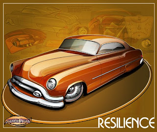
I recently penned a design for Popular Hot Rodding that embodies this approach, taking a relatively forgotten and over-looked car, and just "having at it", bringing in influences from all over the place...
road runner
rendering
...and it was cathartic, man. "You don't do one of THOSE..." I was told... Which only fueled the fire, as such challenges often will in those with a creative bent. I finished the roughs for the car, and began to think of even more rides off of the beaten path. I'm not saying that drawing this car even compared to riding Wiamea for the first time, but the excitement of taking a direction with it (that I've sat on for years) that is fresh sure packed, metaphorically, anyway, the anticipation of paddling out.

I guess that it all just comes down to finding inspiration in unique places, and then summoning the courage to apply it properly. Not to mention boldly crashing though some previosuly closed doors along the way...

More, as always on my site!

Monday, June 15, 2009

Hiring a Hot Rod Designer

Over the last decade, we've seen explosive growth in the hot rod and custom car industry and hobby as a whole. This can be attributed to the popularity of television shows like Overhaulin', American Hot Rod and others, as well as Powerblock TV, the Barrett-Jackson Collector Car Events, and of course, the access to great personalities like Chip Foose, Stacey David and others. This brings in new enthusiasts, and naturally, more project cars!

Not since George Barris snapped thousands of photos and wrote hundreds of articles promoting the hobby back in the 1950's and '60's have we seen so much attention on our hobby, and it's amazing to witness. Yet, while there's all of the excitement, many of these new fans and participants are feeling lost when starting a project. It can be a daunting task to say the least, but when taking those first steps, having the right footing can make all of the difference in the world.

Naturally, any success in a project requires a plan, and building or modifying a car requires very careful thought at this stage. I've often heard guys say "I just build as I go... no plan, just what feels right", and sadly, it certainly doesn't look like it must feel in many cases. Disjointed design, half-assed "fixes" to make parts fit, and often unsafe "engineering" ("engine-beering", most likely) have sent many a project to an early grave. Thus, the best advice would be to bring on an experienced designer to help guide you along. As a professional hot rod and custom car designer with over twenty years experience in the auto industry (from parts and service to body and after-market accessories), as well as training in design and fine art, I'm here to offer some advice on taking those first steps.

hot rod sketch


Five things to consider when hiring a designer:


Unless you have a background in design, you'll want to seek out a designer to help you refine your vision. The importance of having a vision on paper, especially when working with shops and others on a team cannot be overlooked. You'll have a vision of the finished product for everyone to work from, and it helps to avoid gaps in communication, and errors in describing what you want to accomplish.

When shopping for a designer, keep some things in mind:


1. Look for one with a style you like.


Not only are you hiring someone to assist in laying the groundwork for your project, but this person must be able to convey your ideas and tastes, as well as create a piece that will inspire your build team. You'll want some "wow" factor, but also be sure that your designer draws with proper scale and proportion! Taking a cartoon or shoddy "Photochop" to an experienced builder will get you laughed out of the shop. Sure, the kid you hire in a forum can make that '58 Edsel bumper look like it fits your Monza, but in reality, would it? (and are you looking to blow your budget on wild changes before the car even hits primer?) Look around, and study the artist's styles and prior work.
Much like you chose a car that excited you, be it for nostalgia reasons, a certain feeling it gives you, or just the fact that you liked it overall, you'll be miles ahead by selecting a designer in the same way. When the car is torn apart and looking bleak, the artwork will serve as an excitement generator.

custom car design


2. Find a designer you get along with.

Spend some phone and email time conversing with designers. See if you get along, and can communicate freely. An open exchange with your designer will pay off in a HUGE way when working. Look for someone who can help guide, if asked, but also take an idea you have and run with it. Nothing can be more disappointing than getting going with a guy who doesn't listen, or is looking to create a portfolio piece on your dime. On the flip side, simply hiring a "wrist" to make some lines based only on what you say is boring, and will; leave your design "flat". On the same note, just hiring an "artist" who rehashes the same 3D model their last 40 customers got, but with different paint and wheels will get you, well, the same car as those other 40 guys.
Make your budget known, and make sure that your designer understands that.
Make it an open exchange where ideas can flow freely, and you'll be pleasantly surprised how an idea can grow or be refined to mind-blowingly cool in the right hands.

3. Understand the designer's terms.


Get it ironed out immediately when speaking, just how many revisions you'll receive, and what the cost may be above that level. Know how the work will be delivered. Hard copies? (one for you, the shop, and maybe for promotional purposes?) Digital copies for magazine ink? (how about sponsorship proposals?) Can you use the artwork to promote the car? Who owns the Copyright?

A professional designer will furnish a contract spelling this out, allowing for worry-free design time. Check this out from step one, and you'll avoid starting over when your forum buddy disappears with your PayPal payment.


Understand, too, that work will often depend on payment. If you want your designs quickly and well-done, be prepared to pay a bit more, and respect the time required to perfect a design. Much as you wouldn't rush a surgeon reconstructing your body, giving the same consideration to your designer will breed equally functional results!

4. Don't be the "I'll know what I want when I see it" guy.

That guy is the enemy of designers, and it translates to "headache" to any pro. Have an idea at the first consultation, even if it's vague, and ask for direction/advice if needed. Know what you'd like to do with the car. Will it be restored? Modified? A combination of the two? Something wilder? A professional designer will offer examples, and throw ideas around with you, hitting on your likes and dislikes before pencil hits paper. Many great cars develop during these "bench racing" sessions, and you'll save a ton on revisions. Communication is your best friend here. Simply jumping from style to style will burn you and your designer out, and close doors on really creative ideas.
Research the hell out of your project and ideas. Go to shows, cruise nights, rod runs... Pick up magazines, books, videos... Look around at what's been done, and find a style that you like. Make a list of things that you enjoy about cars. Perhaps you enjoy good handling, or maybe straight line performance is more your thing. Maybe it's all about the look of the car, and you're after a show car that'll make people stop and drool. It's this stage that will help determine a direction for the project, and is of HUGE importance.

wheel design

wheel milled

custom billet wheel

You should have a list of your dreams for the car, and one alongside that is more realistic, taking into consideration the reality of the car you've chosen. Approaching a professional designer with these will save time, frustration, and above all, help to nail that "perfect" concept.

5. Don't fall victim to trends.

Simply shopping at the "popular kids" table will, inevitably, breed you a cookie-cutter car. Simply saying "oh man, that car that won Street Machine of the Year had a cool hood, so I want THAT hood, and the same wheels, and the same paint, and then that car that won the year before had those seats... I want THAT interior..." and so-on will not design or build YOUR dream car. Much as you may have enjoyed looking at that model in a magazine ad, would you marry her? Chances are, you'd rather find someone who fits your life, who matched that often undefinable set of criteria that just "does" something for you.

This project car should be no different.


Seek out a designer who understands the style you're planning to build your car in, and can offer unique approaches to design problems that not only make your eyes pop out, but will keep a few bucks from doing likewise from your wallet.

customized
If you've seen a teal green and gray car with a tweed interior and 15-inch billet wheels lately and thought "wow... the 1990's called, and they want their car back", imagine what response a car built in a trendy style today will elicit in ten or fifteen years. "Build to YOUR taste, not someone elses'" is my credo in the studio. Approach modifications tastefully, respectfully, and with the thinking "how does this change affect the rest of the car? What purpose does it serve?" If it makes sense, do it. If it's questionable, question the hell out of it.

That said, head on out and explore... look at work, compare styles, and talk with designers. Your decision should go beyond price, and be the RIGHT fit for your project. Seek out a designer that can listen, offer ideas, and above all, nail your design. After all, simply setting sail on the ocean might take you SOMEPLACE, but is it where you WANTED to go? Hiring a designer will help chart that course, and the end of the journey, when plotted correctly, will have you itching to hoist the sails again, and that's what this whole car thing is all about anyway... feeding that passion.

Saturday, June 13, 2009

Body Double!

Friday morning, as I updated my site and a few posts here, I hopped on good old YouTube for moment, and saw a link to Rancid’s new video, and gave it a look… Good deal, good tune…


But….

Hang on….


armstrong
…is that… ???

…no way….


He sure as hell looks like Corey Feldman!
stand by me

Awesomeness.
...or maybe it's just me.

Thursday, June 11, 2009

Artist Feature... and FREE WHEELS!

I have an upcoming artist feature in the relatively new Benchrace Magazine, an online publication geared toward the hot rod community, and loaded with absolutely killer feature articles each month, and I'm pretty stoked, as this is really the first online 'zine to include my work.


Weighing in at nine issues (when the new one hits, anyway), the magazine has already nailed some killer content, including stuff from guys like Jim "Jake" Jacobs, Tom Fritz, our good pal Jimmy Smith, Dan Picasso and more! Hell, it's even had the great Reverend Billy Gibbons on the pages! Good times indeed!

Suffice to say, it was cool when Robert threw the idea out there to feature my art... I'm always stoked when anyone takes notice of my stuff, and it was a good experience! As part of the fun, I was asked to offer up a print as part of his monthly prizedrawing, and I've obliged, offering up on of my signed/numbered and limited-edition pieces, the Mahi Mah-T:

Add to that (by golly, it just gets better and better, huh?) the chance to win a free set of wheels, compliments of Real Rodders Wheels, just for subscribing (it's FREE, by the way), and the icing is on the cake:

If you get a chance, check it out... I think you'll enjoy it.

Wednesday, June 10, 2009

"Automotive taxidermy"...

...was the term I dropped into the conversation, and it brought on a stare, followed by a knowing grin and a nod of agreement.

I was having a discussion with a friend of mine, and the usual bench racing turned to the topic of restored cars... namely muscle cars and classics, and soon to one-off's like customs and hot rods. Initially, conversation revolved around escalating costs involved with merely buying a muscle car in today's market. It's a large amount of money to even touch anything worthwhile, and it prices the average Joe out of the game from square one. Add to this the recent trendiness that revolves around said collecting, and the people outside of the hobby begin to think that any car manufactured pre-1980 is a collector car, and worth hundreds of thousands of dollars. All of this notwithstanding, we soon hit on the real meat of the situation:

Cars locked in museums.

Granted, I can appreciate a one-off ride being preserved for future generations to enjoy and study... and who wouldn't want a work of art like Cadzilla to be around for a hundred or so years? Yet, to keep the cars locked in a climate-controlled room, pampered (sometimes quite literally) by teams of "preservation technicians", to me, anyway, deprives us of the best aspect of building a car. Actually driving it, and witnessing it in action!

Granted, you're not going to pull a world championship-winning Ferrari F-1 car out for a jaunt to the Circle K (that'd be like asking to fly the Spirit of St. Louis over a stadium, dragging a banner advertising a tanning salon, or a space shuttle around for kicks), and I can't imagine risking the original Hirohata Merc in LA traffic. What I'm getting at is that taking a Camaro or a Mustang, whatever, and storing it inside forever is a waste of the car. Why not just commission a great scale model, or a nice painting, or even a Poloroid?

Cars today are fast becoming trophies. Watch a certain auction, where it's no longer about bringing enthusiasts together to trade vintage rides and share some time... It's about "dig how much money I have!", and then living in fear of enjoying the purchase. I cannot fathom anyone getting so behind this attitude, and helping to hype it. It's a hobby meant to enjoy. The moment anything becomes centered on simply getting rich from it, well... at that point, I've lost any respect for the person(s) involved.

Take the car, and drive it. Not onto a trailer, and then off of it, 30 feet to a spot at a show.... Take it to the drags. Go for ice cream. Hit the park, whatever. If you don't, it's the equivalent of stuffing the deer you bagged, and throwing away the meat. Why not just mount the front clip over your fireplace, and tell stories of the "big block that got away"? In my opinion, there's really no place in the hobby for automotive taxidermy...

And with that, I'll hop off my soap box here...

Friday, June 5, 2009

Red and random...

Got to playing with a series of works lately, all based on a monochrome theme, and thought I'd show one off for a Friday morning:


Suffice to say, it's a rather colorful series, with an interesting mix of contrasting and complementing cars and styles, each coupled with a color chosen in the same way... Hope you dig it.

Thursday, June 4, 2009

Innovation, guest appearances and simple math...

...all combined in my head over the past couple of days. I had been in the studio almost non-stop this past week, trying to keep up, and finishing up some bigger projects, and as usual, began to ponder mysteries of life.

One topic that often entertains my gray matter is that of innovation. I enjoy looking back on instances where one single event or idea made enough of a ripple to change something. Consider skateboarding (not much of that happening with a knee like mine lately)... A simple trick like the Ollie took it from slalom and simple "sidewalk surfing" into a whole new universe. Arials, tricks previously unimagined... Hell, almost all extreme (board) sports can trace some lineage back to this simple trick (consider how surfing was transformed by the arial). Car-wise, consider Sam Barris chopping the first Merc...

...or better yet, his fastback Buick!
Style moved in a whole new direction! Lower, cleaner designs poured from Detroit following this most basic (yet complex) custom idea.

It's all simple math, really. Add where you must, subtract what must be removed for the sake of style, and, if you do your math carefully, you have a winner! Consider that there are an almost infinite number of equations to arrive at a solid design, and it boggles the mind. It all falls on vision, and carrying elements to the right places.

Speaking of innovations, simple math, etc... I listen to a lot of music in the Studio, and I enjoy a broad range of styles. A recent spinning of some classic R & B really got the brain firing on all cylinders. I began to think about guest appearances, and the blending of occasionally different, and sometimes similar elements, and how they can affect the final product, be it music, cars, or even food. Canned Heat recorded an album with the legendary John Lee Hooker, entitled Hooker n' Heat, as the band was getting back to their blues roots.

The album is almost, in essence, a John Lee Hooker album, with the Heat playing backup... But it works. In fact, it's something beyond a simple listening experience... it takes on a life of its own (namely in Wilson's unbelievable harmonica playing-- sadly, also his last appearance). The meshing of Canned Heat's loose, funky, boogie style, with Hooker's down and dirty demeanor make this not only a great listen, but inspiration!

Consider how, in most cases, a guest appearance by anyone (be it TV, music, or anything) is often watered-down. In the case at hand, Hooker just stomps his way in front, and stays there... It's pure "attitude music" if ever such a thing existed.

How does this apply to cars? Like any good design, it's in choosing the right ingredients, and using them to the right level... pulling the most from their potential. It's not about just bringing in the hottest "at-the-moment" thing (remember composite headlamps being installed on EVERYTHING in the '80's? There's a warning.), it's choosing some elements that may be, on the surface, anyway, entirely different... and finding some common ground or theme for them to work from. Looking at the raw material, and then seeking out an element, a slice of character in either a part or a modification that just makes visual "sense". Consider the use of Buick trim on a Merc. Just looks "right" somehow. A good idea that spawned countless clones. I suppose that my point is simply to hone your ability to discern what makes for good design, and to absorb those things that look (or sound!) "right"... and make sense of the WHY (why they look right, why it flows). In short, don't be afraid to kick the tail of your board, invite a different co-host (or opinion), or throw a few new numbers into the equation.
After all, when it comes to innovation or imitation, there's really only one way I'd like to go...

Tuesday, June 2, 2009

The old days...

...sure look awesome when looking over old magazines and photos, don’t they? All of the killer cars, shiny paint, classic locations, impeccably dressed people and so-on. It makes it all the more interesting when you either stumble across (or are handed!) an old snapshot that captures real life… an actual hot-rodding moment, frozen on Instamatic or Polaroid paper… In this instance, we have such a subject; one that makes you say "D'oh!"


57 chevy wreck

Yep, it’s harsh reality, there to smack you in the head, as it always seems to. The photo above came to my desk while hunting for source material to fuel my current background project, documenting East Coast customs and hot rods… My father gave me some surviving photos of old cars and car shows, and mixed in was the gem you see above. The car was his personal ride, a ‘57 Chevy 210 that he originally purchased with a six cylinder. The car received a nifty little 283, bored to 301ci, and backed with a 3-speed, 4.11:1’s, and exhaust he described only as “loud”. The car was respectable and quick for the times, running low 13’s. Not too shabby for a kid, and especially for a daily driver.

Anyhow, the moment above captures the aftermath of a floor shift install. Say what? OK, not the
IMMEDIATE aftermath… You see, my dad had installed a floor shifter that fine day, and, like so mmany times that I’m sure we can all look back on and say “yup… done that!”, he rushed through to get to work on time (night shift!), and we all know how shifter installs seem to go… Something ALWAYS goes a little haywire. Needless to say, shifting from second to third resulted in, well, nothing.

Youthful thought offered the option to just reach through the ample hole in the floorboard and grab the linkage, when the stars aligned to strengthen the bowtie camp in the infamous Chevy versus Ford battle... and the mighty tri-five Chevy plowed into a ‘63 Fairlane. Certainly ironic.

The car was fixed, using the remains of a t-boned Bel Air hardtop, with the same car supplying the interior for this same car a bit later. The car was sold when my father entered the service, and marked a three year span of ownership in his life. We’ll have to look at the ‘64 Impala and ‘66 Charger that followed at some point, too, all with somewhat better results!

Granted, I’ve done worse myself (and with no shift linkage to blame!), and that’s not the point here… It’s just an interesting look back on a moment frozen in time… one of those images you don’t often see. It’s real life mixing with youth, hot rodding, and all of those experiences we try to teach our own young ‘uns with…

Monday, June 1, 2009

Art imitates, well, uh....

...what might be art in some other warped dimension.

In an age when everything is either "inspired by" or "derived from", or "created in partnership" via some "creative commons licensing agreement", it gets to a point where we have to celebrate the nearly mundane when it finally produces an original thought. (consider U2 ripping the Escape Club, who ripped Elvis Costello and so on...) This, as you can imagine, pisses me off. Hell, if you know me, kittens can piss me off, so this isn't really much of a stretch.

Anyway... While discussing the van culture of the '70's recently, I stumbled across a video for an old movie "The Van" (not to be confused with the mode of transport your creepy neighbor who works at the chloroform plant is always hauling candy and rags in)... and instantly recognized a similarity between 1974 and the present day (beyond bad acting, terrible haircuts and really shitty cinematography).

This clip:

Is eerily close to any reveal on "Pimp My Ride"....

Odd...certainly. Creepy as all hell... why yes it is.

Considering the two, I think I'll take vannin'. Less chance of having to listen to crappy music and deal with some trendy sporting stupid shades and a fauxhawk... and my Converse All-Stars will still be in style. Keep on vannin', or whatever.

...that said, I got nothin' else. Enjoy the mind-blowing-ness that is modern entertainment versus van movies.

Dial 3 for...

...3D, I guess.anaglyph print

Having always been a fan of classic movies, and even more, an Alfred Hitchcock fanatic, I took a rare couple of hours last week to sit and watch a film. The day’s selection? “Dial M For Murder”, Frederick Knott’s great play-turned film. If you’ve never seen the movie, do yourself a favor, and scare up a copy. It’s typical Hitchcock visionary cinema, and is so far ahead of its time, presentation-wise, that it boggles the mind. What’s really slick about the film (beyond the incredibly intimate camera angles) is the use of very limited sets. The majority of the film takes place in an apartment, by the the story makes you forget that.

Anyway, why bring up this film? The movie was filmed and subsequently released in 3D back in 1954, coincidentally, the year that the fictional scene depicted in the image with this post takes place (...it always ties together, doesn’t it?). What’s great about this film in particular is that it wasn’t the typically hokey 3D spectacle… It used the effect brilliantly and subtly. Granted, in ‘54, there were a ton of 3D movies, and most of them bad, thus, “Dial M for Murder”, shown in 3D, didn’t fare so well, which is a shame, because, as we’ve touched on before, it was done superbly and subtly.

If you’ve got a pair of the old red and blue 3D glasses laying around, dig on the pictures that accompany this post…


moonshine runner 3d
I’m a fan of subtlety, always opting to take the “less is more” route, and playing with a design to harness some serious visual impact from a well-placed modification. Perhaps that’s why Hitchcock’s films appeal to me: they are well-crafted, and sort of sneak up on you, making you re-examine a scene, study the details a bit more carefully, and pay closer attention. In the last issue of Rod and Custom, I was fortunate to have had another piece featured as their “Dream Car of the Month”, that being the ‘53 Ford moonshine runner, which illustrates this subtle approach perfectly. There’s a lot going on with this car, but it’s presented in a very subtle way (on the car itself, anyway… Racing through the woods in a custom car isn’t precisely “subtle” by any means…). It’s got many layers to dig through, and the narrative behind the image is pure fun… But it’s what was on my mind when creating it that makes this so damn cool.

When I began drawing the car, the scene was already set in my mind: there would be a dark, moonlit night in 1954 (ahhh…. it’s all tying together!), a bed of red clay, a police car in pursuit, and some moody lighting. But what made this piece unique in my portfolio was that I kept seeing this thing in 3D… stereoscopically. I set out to create multiple versions of the piece, and there had to be one that used 3D glasses. No two ways about it, that’s what my mind kept going back to, and I was determined to reach into my bag of tricks, pull out a clever technique, and apply it to this piece.

It was fun to make the trees “pop” out and recede, to make the lights gain some depth and “flicker”, and to work to make the features of the car visually sit in their rightful places in space. It’s a lot of work to get things “right” (working a drawing into 3D isn’t as easy as working from a couple of photographs, and requires a TON of planning and work… but the results are just damn cool), and when they fall into place, the results are stunning. I’ve been experimenting with a number of my older pieces using this technique, and I even have prints available (with killer plastic-rimmed anaglyph glasses-- comfy and stylish!) on my site at www.problemchildkustoms.com

In any event, what this all boils down to is that I’m happy to be having fun with it all again, and after applying some inspiration from a great cinematic experience, I’ve embarked on a new path with my work… It’s getting to the point where I can invite you to reach into my work, and see it in a whole new way… and how cool is THAT?!

hot rod artLook for more soon…